A lot of people treat user experience and conversion rate optimization as the same thing. They are close, and they overlap, but they are not the same job.
CRO and intuitive UX aim to help users get things done with minimum effort. They both involve tailoring the product to the user and user testing. However, they are not the same.
The two terms get mixed up easily, so this guide draws the line between them and shows how using both together lifts your conversions.
The short version
- UX and CRO overlap but are different jobs: UX is the whole experience a user has with your brand, CRO is lifting the share who take a desired action.
- You need both: CRO shows which pages matter, UX makes the wins stick by designing for a real person, not a traffic number.
- Fix the small things first, because details like slow load, 404s and clutter leak conversions before the big wins ever land.
- Quick wins you can do today: speed, mobile responsiveness, white space, real in-house images, clear icons, and unified CTAs.
- Then keep optimizing with surveys, tracking and user testing (Hotjar, Google Analytics, Maze).
What Is Intuitive User Experience?
Have you ever used a streaming service with no option to turn autoplay off? Have you felt iffy about purchasing a product because it "feels" like a scam?
Even when landing on a website, we are all sick of those spammy questionnaires and cookies. We get annoyed when we're forced to navigate through pages without structure where we can't find helpful information and end up wasting time. All of these things go into account when we talk about user experience.
User experience includes users' overall journey, feelings, thoughts, and behavior patterns when using our product. It is everything a user comes up against when interacting with your brand.
How do UX and CRO work together?
We believe in our products, so naturally we want as many conversions as possible. That is where Conversion Rate Optimization comes in: you test every element, down to the buttons, to win more of the visitors you already have.
By definition, conversion rate optimization (CRO) is the process of increasing the percentage of users or website visitors to take a desired action (such as buying a product or leaving contact details).
Now, you might think: "Where does UX come in then?" This is where it gets interesting.
Your potential customers don't want to be pigeonholed into decisions and seen as a walking bag full of money. UX provides the "human" element, forcing us to think about the user's feelings so we keep in mind that we are designing products for real people.
If you do UX right, in return you get a loyal recurring customer who will not only enjoy the service but be more than happy to recommend your product to their peers. Great UX gives you a chance to build a genuine connection that can spark even more business opportunities.
In short: CRO pushes for more conversions but relies on UX to make those gains stick, while UX pushes for happier users but relies on CRO to show which pages matter most. You need both.
Why Details Are Important in UX
The small things are the foundation of a website that converts. Fix the little leaks first, because no amount of big-picture work makes up for a site that frustrates people in the details.
When planning, it is easy to fixate on the obviously profitable parts of the product, since that is how many companies measure success. Do that and you miss the smaller wins that add up.
Making the product genuinely convenient buys you room for mistakes, tests, and improvements. Here are the sections most often overlooked on websites and apps:
Awards and Partnerships
If your product has won awards or you partner with a strong brand, use that to win trust with new visitors. This is the first piece of something we will keep coming back to: social proof.
Example of social proof: If you are selling smartphones, having Apple or Samsung co-sign will grant you a boost in trust since you are using their well-established brands as the most prominent mobile phone retailers in the world.

Example: Webflow social proof bar below hero shot, from webflow.com.
User Reviews
A mistake we see constantly is neglected reviews. Plenty of the sites we audit bury their reviews at the bottom of the page, under filler. And fake reviews are always a mistake, no exceptions.
Worse still is having hundreds of reviews and no link to read them all. If you have that many, you are sitting on one of the strongest trust signals there is. Use it.
Three rules for reviews:
- Place user reviews as high as possible in the page hierarchy.
- Have a button/link that leads to ALL reviews.
- Never ever use fake reviews.

Example: Lumin men skin care user review on home page, from luminskin.com/.
Simplicity
You might have noticed a minimalistic trend everywhere, ranging from architecture, furniture, design, art, and even websites and applications.
Why? Because it works. This is where most businesses go wrong, cluttering their websites and apps with unnecessary content.
The best example of simplicity is a tool you use every day: Google. From the start it has stayed consistent and minimal. A search bar, a few links in the header and footer, and that is it. The design barely changes, and you never need a tutorial. You type what you want and you are searching the web. That is great user experience.

Example: Google search engine simplicity, from google.com/.
Onboarding
A common mistake most businesses make when creating their product is not providing enough information on how to actually use it. When making a product, we get so involved with it that we can use it in our sleep.
However, this gets us disconnected from the user since they see it for the first time when we release it. When creating a good user experience, we must go the extra step and try to make usability as smooth as possible.
There are a couple things we can do here:
Email onboarding
Emails are a great tool for onboarding both new and existing users. Software keeps changing and rolling out updates, so you have to keep reminding users what your product can do. There is no better channel for that than the one they check every day, their email.

Example: Email from Breezy HR explaining their new feature, from breezy.hr/
Guides
Whether we like it or not, people nowadays get most of their information online, and content is king on the internet**.** That's why a practical way to onboard your users is through guides, which can be in the form of blogs, videos, or downloadable resources.We do it on our website, too. Here is one guide on how to write PPC ad copy like a pro.
This can also become an excellent thing for your business as you may inspire content creators to play around and create guides for your product, thus creating a loyal community for both themselves and you!

Example: Free interactive resources from Design Strategy, from designstrategy.guide/
Checklists
Checklists are a good form of bite-sized content that you can constantly produce to educate your users. In some situations, checklists can be a better option than guides since the content is easily digestible and fun for the user, as it encourages them to "check off" things they have learned. It gives them a feeling of progression and accomplishment.
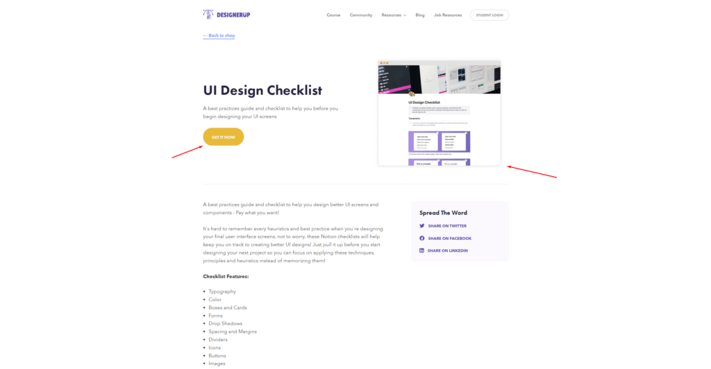
Example: Free design checklist from DesignerUp, from designerup.co/
What can I do to improve UX on my website right now?
Now that we have gone over some of the frequent mistakes, we will give you a couple of tips you can use to improve user experience on your website today.
1. Optimize load speed
One of the first things you can do is to optimize your load speed by reducing image size, cutting out unnecessary scripts, etc. If your website is too slow, it will cause frustration among the users, who will exit without even looking at your product.

Example: Speed test done on apple.com on browserstack's speed lab feature, from browserstack.com
2. Be mindful of 404s
Even though there is no actual harm with search engines when it comes to 404s, users can find them frustrating since the links don't lead them where they want to go. We suggest installing software on your website that detects 404s and removing as many as possible.
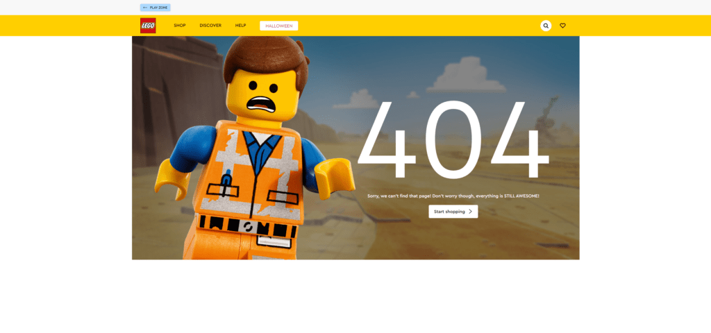
Example: Lego 404 page, from lego.com
3. Make your website responsive
Not only will Google penalize you if your website is not responsive, but it is also really bad for the user. Think of it like this, the better job you do across all devices in presenting your information and providing a good experience for the user, the better chances you have for a higher conversion rate.

Example: BMW responsive home page, desktop and mobile version, from bmw.com/
4. Use white space
Businesses often skimp on white space because empty areas feel like wasted room. In practice the opposite is true: spacing content out with margins and padding makes it more readable and lets people take it in faster, which is a better user experience.

Example: Apple using white space to make their new iPhone stand out and draw the users attention, from apple.com/
5. Use images
"A picture is worth a thousand words," but not a stock one. Stock images have their place, but real photos of your product, or your team using it, reassure people in a way a generic image never will.
Since many businesses use stock photos, the user is bound to sooner or later recognize that you are using the same image as other businesses, which can reflect poorly upon you, so remember to use as many HD, in-house images as possible!

Example: Xiaomi displaying the construction of their phone with powerful in-house photography, from mi.com/
6. Use icons
You have only the first few seconds to catch a visitor's attention, so give them bite-sized information fast. Icons help here: they can stand in for words or whole sentences, as long as the style fits your brand.
![]()
Example: Icons explaining features of a boosted board, from boostedusa.com/
7. Unify and think through your CTAs
Being the most valuable part of our funnel, we should dedicate extra time to our buttons. You can do two things here: make sure the copy on the buttons is optimal and unify the colors. This will create consistency in the user's mind, reducing second-guessing.
Additional Steps for UX
Now that we have pointed out some of the frequent mistakes and provided some quick UX tips you can use on your website immediately, let's talk about further steps. Providing a good user experience is ongoing, so we must keep optimizing our product through various methods.
1. Surveys
The first thing we can do is implement surveys. This is an excellent way for the users to tell you their needs and what they want to see. This is a real gold mine of feedback since it's coming from the people using your product.
We recommend Hotjar for this. It runs solid surveys and throws in extras like heatmaps and session recordings, and it is trusted by companies like Adobe, T-Mobile, Microsoft, and Nintendo.
2. Tracking
The second thing is implementing tracking software. By doing this, we can see heatmaps, recordings, and other helpful information and use that to create a smoother experience for the user.
In our experience, Google Analytics and Hotjar should be enough for all your tracking needs. A combination of Google's reports and Hotjars sessions should give you more than enough information to provide and optimize a great user experience.
3. Testing
The third thing is testing with users before rolling out updates. Multiple companies offer user testing services, so we can get valuable information for a small fee (like eye tracking software) and use that to create a smoother flow.
If your product requires user testing before rolling out an update, or you are launching a new project, we recommend Maze since it offers your data from real users testing your products.
The Bottom Line
User experience and conversion rate optimization go hand in hand. You need both to give people the experience that turns them into loyal customers, and the more you sharpen the two together, the better your odds.
Always try to put yourself in the user's shoes and ask yourself: "What would make you angry, happy, annoyed, or confused when visiting a website?" When answering these questions, empathy will be your best friend.
These tips are a starting point, and they pay off for you and your customers alike. The thread running through all of them is simple: design for a real person, not a traffic number.
For one psychology-backed tactic that lifts conversions on its own, read our guide to the breadcrumb technique. And if you would like a second pair of eyes on your funnel, our conversion rate optimization service includes a full CRO and UX review.
Frequently asked questions
What is the difference between UX and CRO? UX is the whole experience a user has with your brand: their journey, feelings and behaviour. CRO is the process of increasing the percentage of visitors who take a desired action. They overlap and share methods like user testing, but CRO leans on UX to make the gains stick.
How do UX and CRO work together? CRO pushes for more conversions but relies on UX to keep those gains, while UX pushes for happier users but relies on CRO to show which pages matter most. Sharpen the two together and you turn visitors into loyal, returning customers.
How can I improve my website's UX right now? Start with the quick wins: optimise load speed, fix broken links and 404s, make the site responsive, use white space, replace stock photos with real in-house images, use clear icons, and unify your CTA copy and colours.
Why does social proof matter for conversions? Awards, partnerships and reviews build trust with new visitors. Place reviews as high on the page as you can, link to all of them if you have many, and never use fake reviews. Borrowed trust from a strong partner brand works the same way.
What tools help you optimise UX? For feedback and behaviour, Hotjar runs surveys, heatmaps and session recordings. Google Analytics covers tracking and reports. For testing changes before you ship them, Maze gives you data from real users.